The business of simple marketing
A large part of what marketing should do is distill a client’s desired messaging into an easy to understand and actionable message. This isn’t always as easy as it might seem. Clients, of course, are in the business of making money and want to convey all products/services/offers at the same time to the same audience. To them, that seems the most efficient use of the air time or ad space.
In the marketing world, we know that doesn’t work. There are too many copy points muddling up a message and in the end the audience has no idea what to take from the ad, let alone feel compelled to act on it. That’s assuming they stick with the ad until the end rather than tuning out entirely after one or two sentences.
To hit the right mix of messaging, marketers and advertisers must take on the perspective of the audience. What do they want to hear or see? What motivates them to take action? What do they relate to? Ultimately, this perspective usually requires compromises in the messaging to ensure clarity and maintain motivation to act on the message. Simplicity in messaging is key, and sometimes saying the word “simple” is meaningful.
Don’t confuse simple with easy, though, when it comes to determining the ultimate messaging. Easy connotes needing to put forth the smallest amount of effort to get something done. Simplicity, however, usually requires time and effort to parse out the most meaningful message and hone it to be most effective.
To this end, the ad material can’t just say something is simple. It must show it, or in some way prove it. Audiences won’t take your word for it because they know better. They’re smarter than that. And they’ve run into “simple” things that turned out to be quite difficult (like the reviled “plug-and-play” computer accessories from the late 1990s that were more like “plug-and bang your head against the desk and reinstall everything on your computer-then play”).

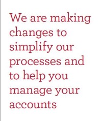
Cover of a bank brochure promising simplification of processes to help with my banking. So far, so good.
Nothing I’ve said here is new or truly enlightening. It’s mostly common sense. Yet I still come across brands that promote simplicity but can’t back it up. Case in point: I received an e-mail from my bank that they were making changes to simplify my checking account. All I had to do was log-in to find out more about the changes (mistake #1: why couldn’t they just tell me in concise, general terms what was changing in the e-mail?). After logging in, I couldn’t find the document detailing the changes as it wasn’t in the logical places, like Messages & Notifications section, but buried in small type in a side menu after I selected the account in question (mistake #2: not making it simple to access the document). It got worse from there. After downloading the document and opening it up, I got nervous when I saw it was a three-page PDF. That’s never a good sign for something supposed to “simplify” anything. Yet the cover of the PDF talked about the how this change simplifies my life (my interpretation of this cover), so I thought I would give it a chance.

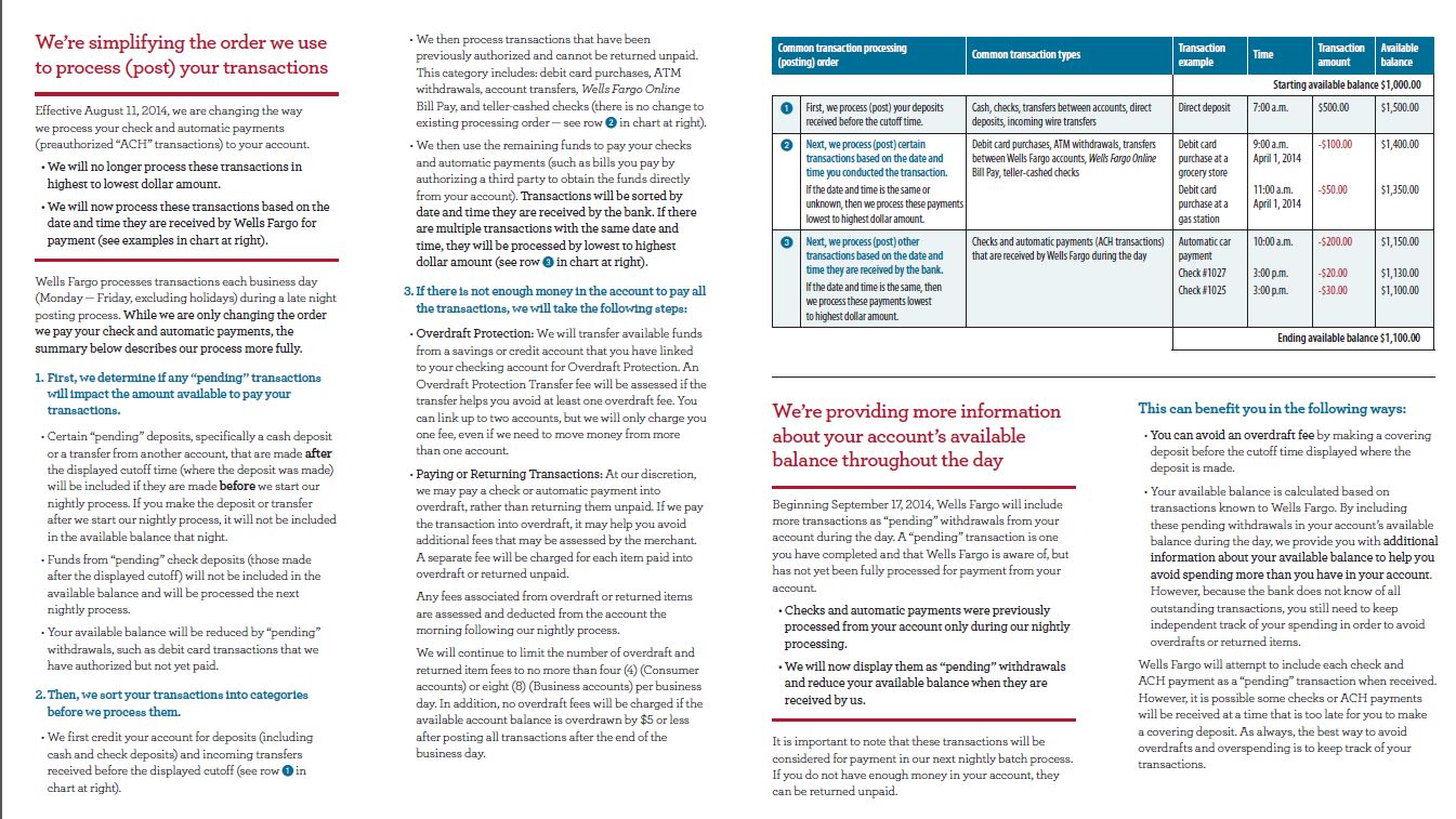
Copy. Lots and lots of copy, with a chart to boot, don’t do anything to further the message of simplifying banking. Less is more.
Then I scrolled to page 2. OMG. I panicked and closed the document. Three times. Then I finally read it. Wall-to-wall copy with a chart thrown in. I started having flashbacks to my macroeconomics course in college. Turns out, after wading through all the words, it was pretty much stuff I thought they were doing already, made more complex (not simplified!) by the lengthy explanations of why this is better and simpler.
I get that legally they probably have to do documentation like this, but make that whole thing back-up/supporting material. Why couldn’t they just have a document that simply said “we’re making checking simpler by processing your payments in the order in which they’re received”? Done. I got the point, know the changes aren’t to fees or anything, and NOW if I want to read more, I can download the “simple” novella and have every single question answered.
Simplicity makes life easier. Learn it. Love it. Embrace it.


